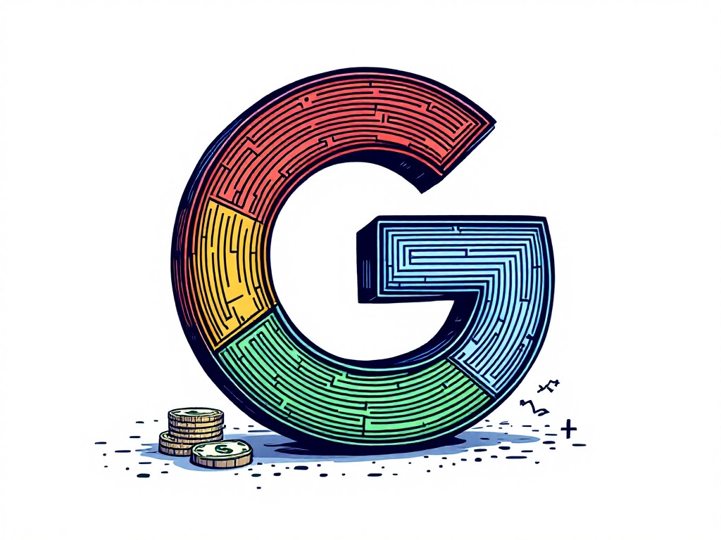
Google Refreshes 'G' Logo for the First Time in Nearly a Decade

Silicon Valley, Monday, 12 May 2025.
Google has unveiled a modernized ‘G’ logo with a gradient color effect, aligning with its AI-driven design strategy without altering its full logo.
A Decade-Long Wait for a Refreshing Change
In a strategic move aligning with its increasing emphasis on artificial intelligence (AI) products, Google has revamped its iconic ‘G’ logo for the first time in nearly a decade. The timing of this update speaks volumes about Google’s adaptive branding strategy in the fast-evolving tech landscape, where visual identity plays a critical role in user engagement and brand perception. The reimagined icon now features a vibrant gradient effect transitioning seamlessly among the traditional red, yellow, green, and blue hues [1][2].
Aligning Design with AI Strategy
The incorporation of a gradient in the ‘G’ logo is intended to create a visual harmony with Google’s AI features, particularly under the Gemini brand, which already employs gradient effects prominently. By doing so, Google aims to create a cohesive design language across its platforms, reinforcing its positioning as a leader in AI technology. This change is reflective of the company’s broader effort to integrate AI deeply into its product offerings and align its visual identity accordingly [2].
From Apple’s iOS to Android: A Gradual Rollout
The updated logo first appeared in the Google Search app for iOS users as of yesterday and has been rolled out to Android with version 16.18 of the Google app. Despite the subtlety of this change, ensuring users aren’t overwhelmed by stark visual shifts, the new icon marks a significant step in Google’s continuous evolutionary path. Such updates are strategically released in waves to gauge user responses and optimize the design’s impact without disrupting the user experience [1][2].
Future Prospects: Will Other Logos Follow?
Interestingly, while the ‘G’ logo undergoes a transformation, Google’s main six-letter mark remains unchanged, sparking speculation about potential updates to other logos under Google’s vast product array. Given the current design shift, it’s plausible that other logos, such as those for Chrome or Maps, may soon adopt similar gradient themes to maintain brand consistency across platforms. However, no official confirmation has been provided by Google, leaving room for anticipation [1][2].